
With so many devices around it’s important that your website looks good no matter what screen size it’s being viewed on.
Which is why it’s not just ‘mobile-friendly’ that’s important – it’s ‘user-friendly’ that is the key to reaching a larger audience.
At Luno we design ‘user-focused’ responsive websites. Designing websites that utilise a mobile-first approach enables a business to reach a wider audience since a larger proportion of website traffic is now on mobile devices rather than desktop.
Designed for the modern web
The mobile web is growing at an extraordinary rate. Ensure your website can meet the demands of your users with a responsive website design by Luno.
Talk to Garry or Nikki today
As a small team of two (and our small network of freelancers) we work with clients on an individual level; no account managers or sales people, no BS, just full on support from two friendly web designers.
We use the latest technologies, standards and techniques on our projects:


We work with clients both big and small
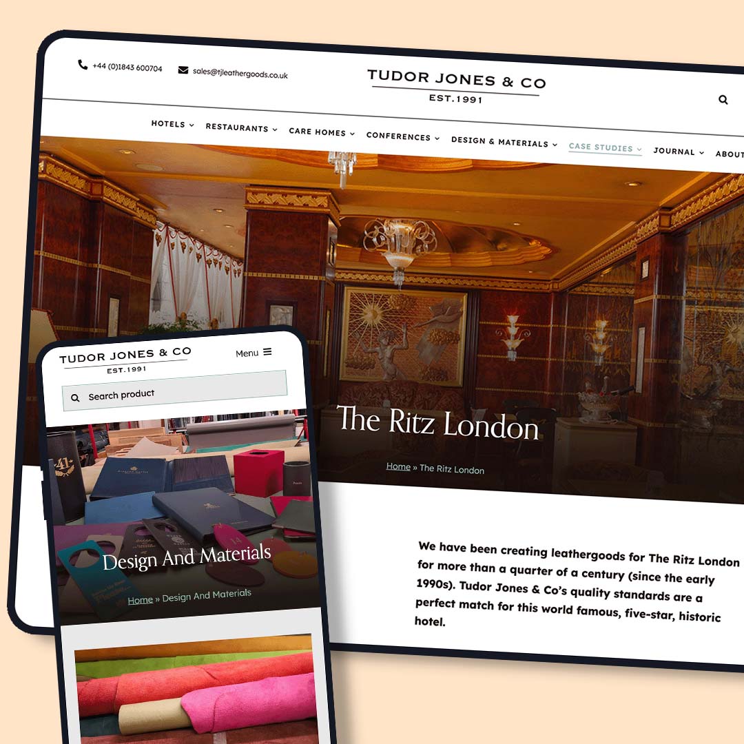
Tudor Jones & Co.
A clean and laser focused website designed to nurture leads by showcasing the high quality handmade leather goods the team have been producing for over 30 years.
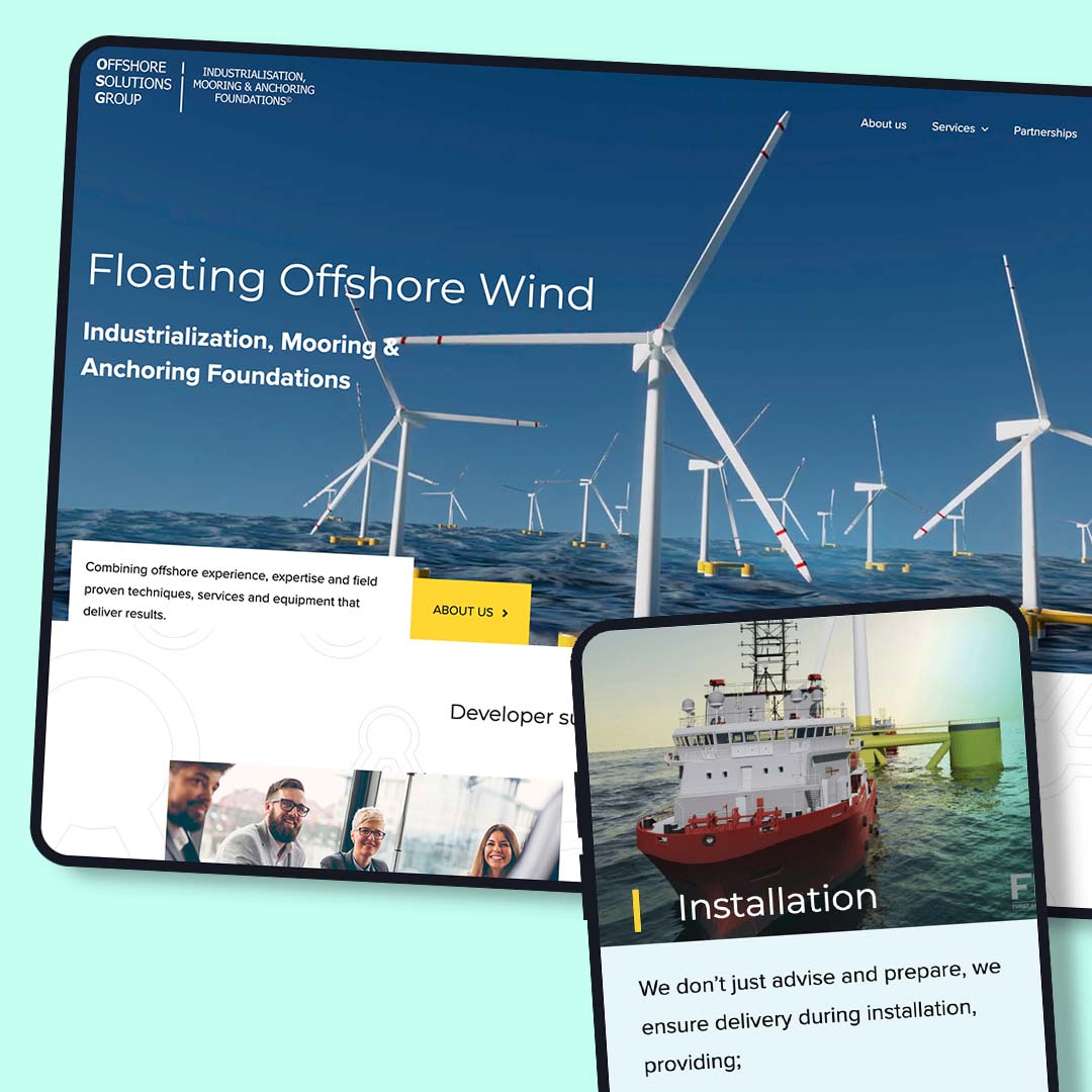
Offshore Solutions Group
A modern website designed with a strong visual language to promote the capabilities of Offshore Solutions Group, a growing multi-disciplined team of renowned experts in offshore and floating energy.
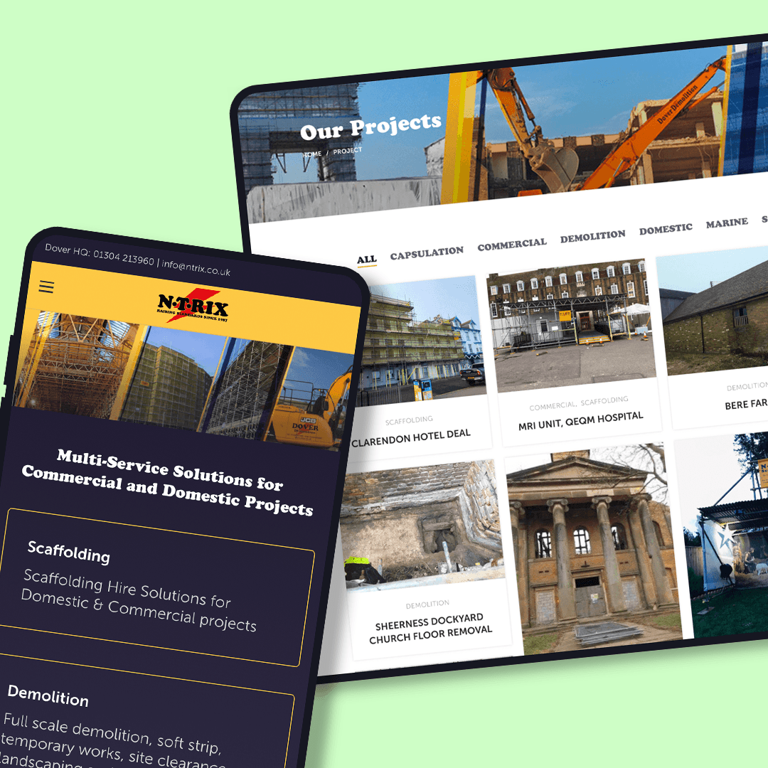
NTRIX scaffolding
A corporate ‘umbrella’ website designed to combine the multiple services offered from NTRIX, a long established scaffolding provider in Kent
